Vastu Logo Presentation
Scroll down
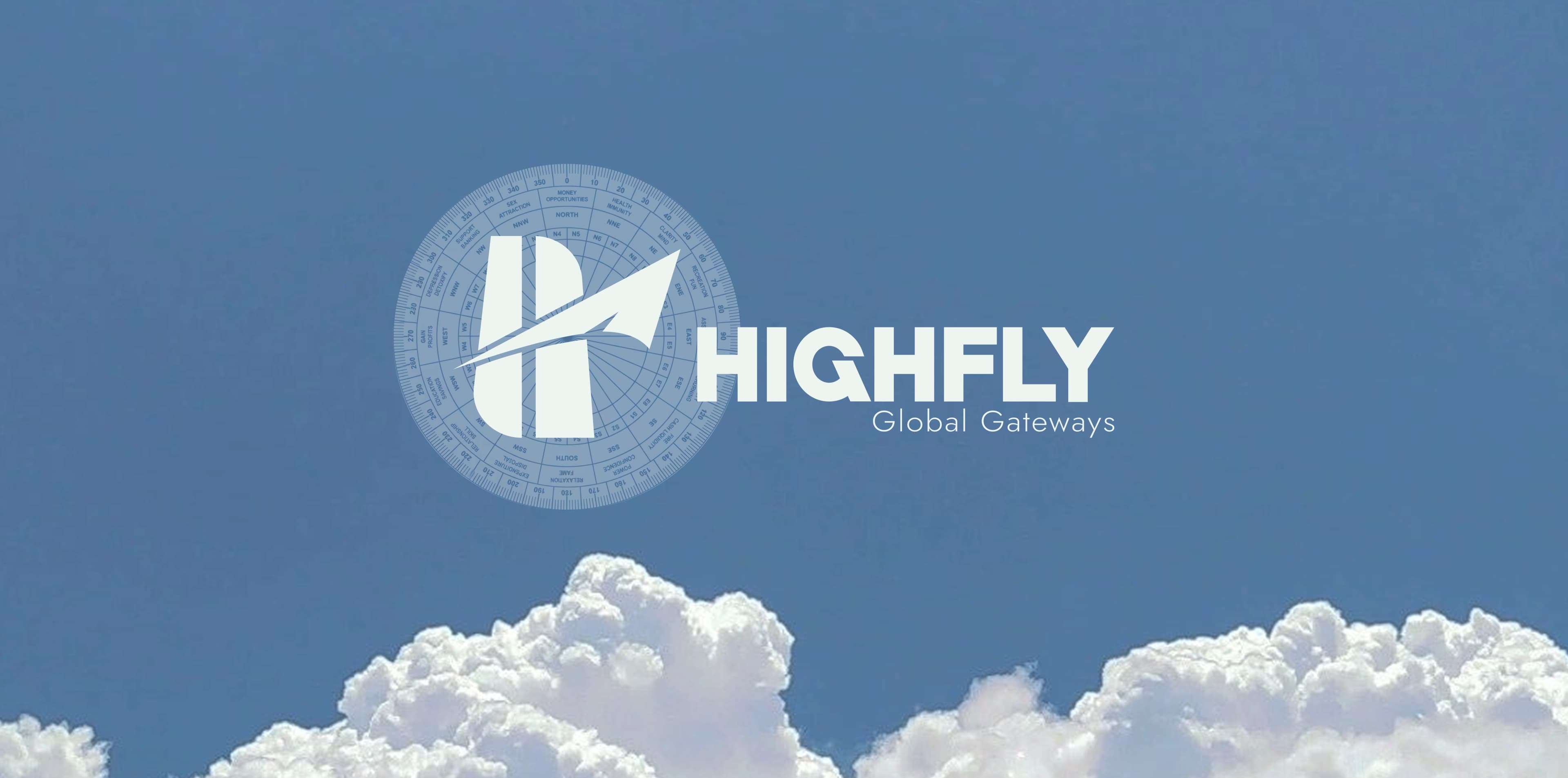
Overview of brand
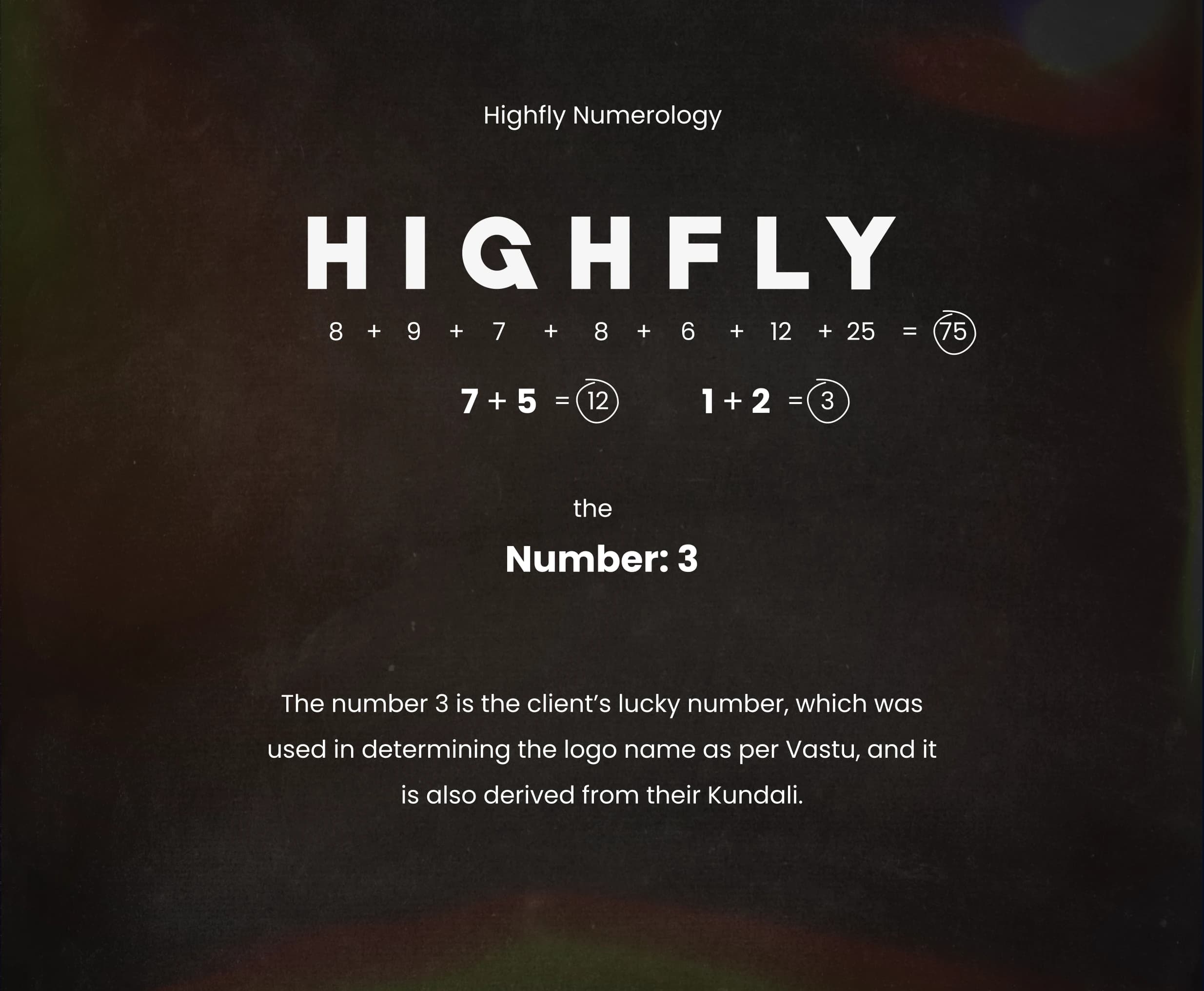
Identity & name energy
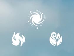
Pancha Bhuta - element alignment
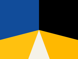
Auspicious palette · Vastu color map
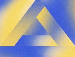
Sacred geometry · symbol meaning
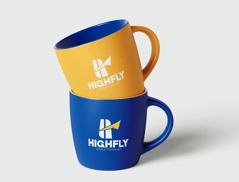
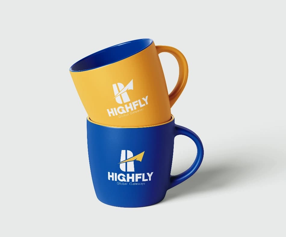
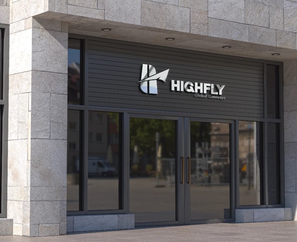
Final logo · real-world applications
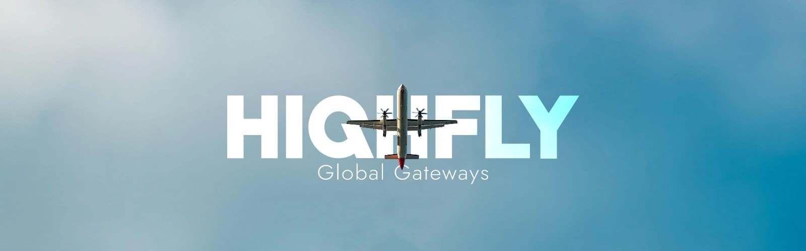
Highfly Global Gateway is a visa and immigration services company with over 6+ years of experience guiding students, working professionals, and families toward their international goals. With a team of expert advisors and a fully transparent process, Highfly takes the complexity out of visa applications — turning what feels overwhelming into a clear, step-by-step journey. Thousands of individuals worldwide have trusted Highfly to open the doors to their future abroad.
![[object Object]](/_next/image?url=%2F_next%2Fstatic%2Fmedia%2Fbottom-left-img.9af4ceb1.webp&w=3840&q=75)
![[object Object]](/_next/image?url=%2F_next%2Fstatic%2Fmedia%2Fbottom-right-img.16f099df.webp&w=3840&q=75)
The brand is aligned with elements that represent movement, expansion, and global opportunities, reflecting its vision to help individuals grow, explore new horizons, and connect beyond geographical boundaries.

Fire drives the ambition. Triangle tip shows Energy & action

Represents travel, movement, and seamless connectivity across different locations and opportunities.

Earth provides the foundation. Rectangles shows Stability & trust
Consistency in brand color facilitates instantaneous recognition and reinforces brand identity, with each color specifically chosen to align with the core philosophy and industry of the brand.
Blue Main
RGB: 17, 76, 154
CMYK: 89%, 51%, 0%, 40%
Golden Yellow
RGB: 255, 193, 15
CMYK: 0%, 24%, 94%, 0%
Charcoal Black
RGB: 33, 33, 33
CMYK: 0%, 0%, 0%, 87%
Lime White
RGB: 245, 242, 232
CMYK: 0%, 1%, 5%, 4%
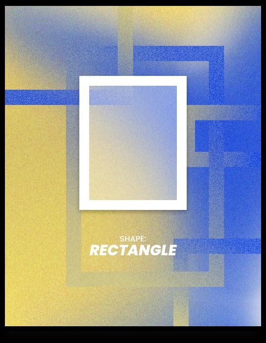
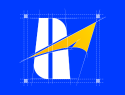
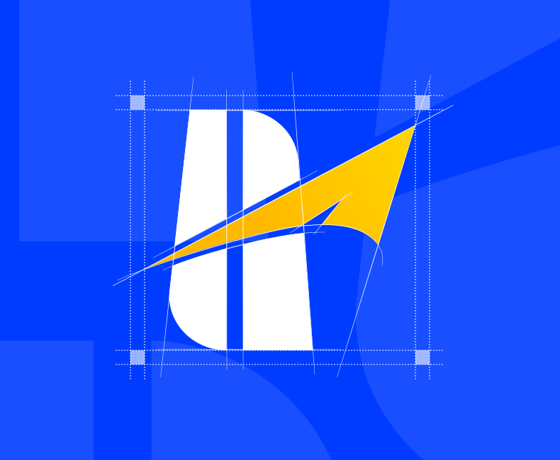
While Air drives the logo, at the core of the logo lies a system of vertical rectangular forms, which represent the Earth element (Prithvi).
In the context of a visa consultancy, this becomes especially meaningful. Users are making important life decisions — relocation, career shifts, and global transitions. The rectangular framework subconsciously communicates:
“You are supported by a stable and dependable system.”
These forms act like pillars or gateways, reinforcing the idea of strength, security, and guided pathways.
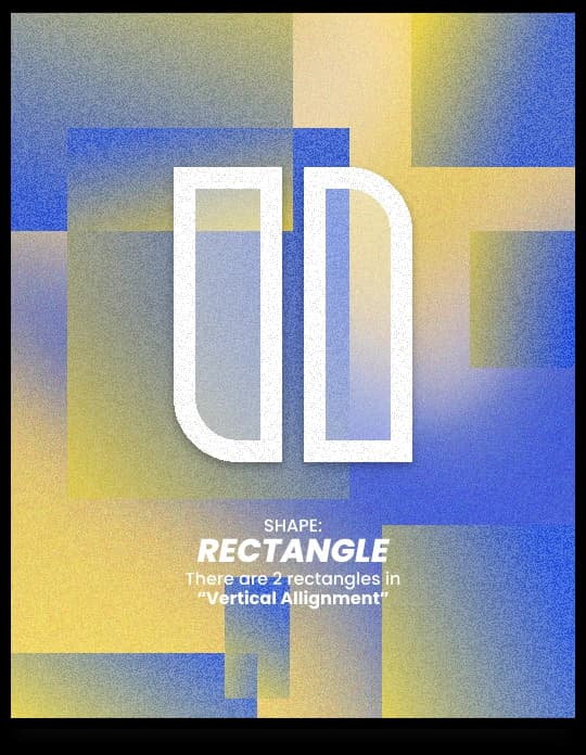
The vertical orientation of these rectangles further enhances the Vastu alignment.
Rather than chaotic expansion, the design reflects:
“Organized progress built on a strong foundation”
This is crucial for a brand like HIGHFLY, where trust and process clarity directly impact user confidence.
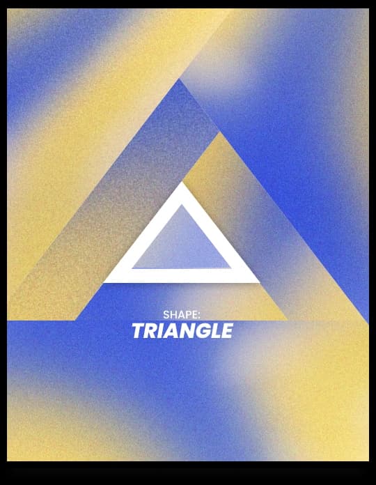
Cutting across the rectangular structure is a sharp, upward-moving arrow, formed using a triangular shape — representing the Fire element (Agni).
It transforms the static stability of rectangles into active progress, symbolizing the journey from aspiration to achievement.
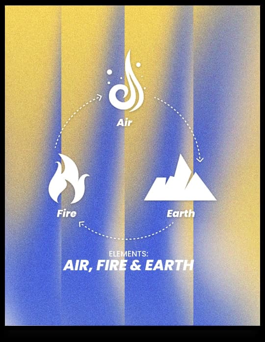
A harmonious blend of Air, Earth, and Fire creates a balance between movement, stability, and growth.
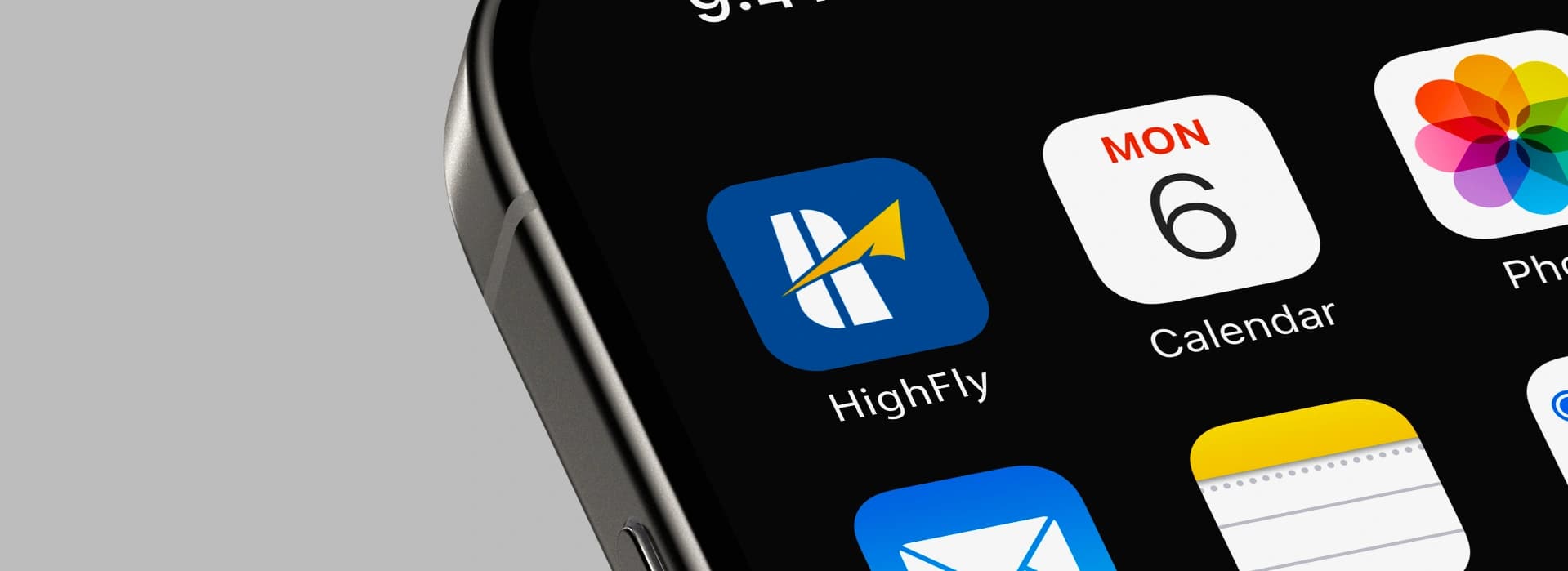
The logo combines strong rectangular forms for stability, a dynamic upward arrow for movement and global transition, and a sharp triangular tip for ambition — together creating a brand that represents structured, reliable, and forward-moving growth.